Brand
Haydn's Açaí
Toronto's first self-service açaí and frozen yogurt opened in June 2025 with the purpose of bringing a new experience to the city, a place for premium flavors, personalized fun food experiencies and connections.
Position
Designer


Services
-
Brand Identity
-
Illustration
-
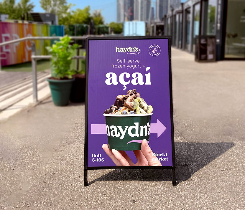
Print materials
-
Merchandise design
-
Website design
-
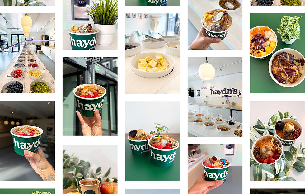
Product photography
-
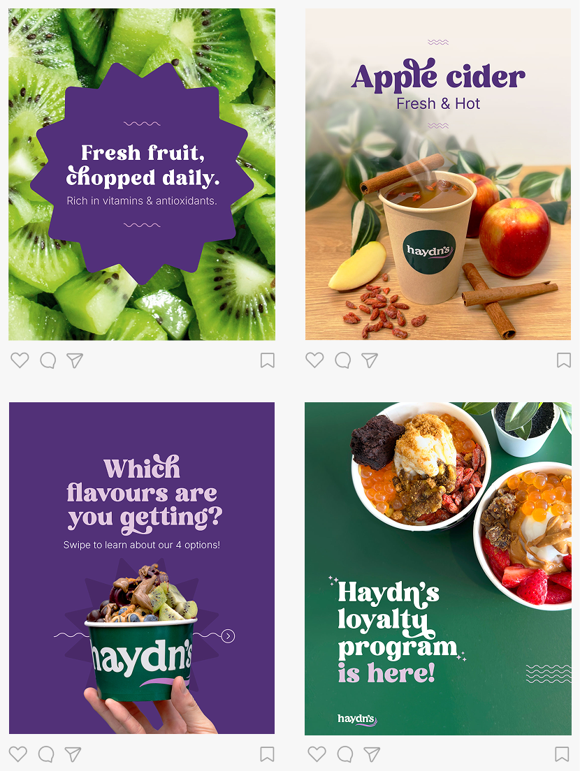
Social media design
Objective
The goal was to develop a brand focused on the product.
The concept behind the identity was inspired by customers experiences and feedbacks: the store was seen as fun, and customers love being able to personalize their bowls their own way.
Every design element was created to reinforce this fun and personalized identity, using photos that show different bowl combinations, and a typeface with a multiple ligatures and alternates, to allow flexible and dynamic content creation.
Business Impact
-
Store improvements were driven by ongoing customer research through social media and in-store feedback.
-
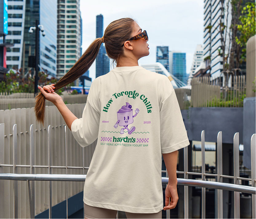
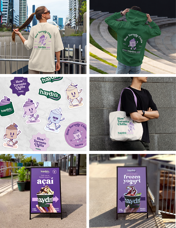
Characters originally created exclusively for merchandise became popular, generating purchase demand among customers.
-
Regular Instagram posts featuring weekly store promotions helped build customer loyalty.
-
Improved product photos increased purchase desire among customers on social media. Bowl photos receive high engagement and interaction.
Services
-
Website design
-
Product photography
-
Social media design
-
Brand Identity
-
Illustration
-
Print materials
-
Merchandise design
Services
-
Brand Identity
-
Illustration
-
Print materials
-
Merchandise design
-
Website design
-
Product photography
-
Social media design
Objective
The goal was to develop a brand focused on the product.
The concept behind the identity was inspired by customers experiences and feedbacks: the store was seen as fun, and customers love being able to personalize their bowls their own way.
Every design element was created to reinforce this fun and personalized identity, using photos that show different bowl combinations, and a typeface with a multiple ligatures and alternates, to allow flexible and dynamic content creation.
Impact
-
Store improvements were driven by ongoing customer research through social media and in-store feedback.
-
Characters originally created exclusively for merchandise became popular, generating purchase demand among customers.
-
Regular Instagram posts featuring weekly store promotions helped build customer loyalty.
-
Improved product photos increased purchase desire among customers on social media. Bowl photos receive high engagement and interaction.
Objective
The goal was to develop a brand focused on the product.
The concept behind the identity was inspired by customers experiences and feedbacks: the store was seen as fun, and customers love being able to personalize their bowls their own way.
Every design element was created to reinforce this fun and personalized identity, using photos that show different bowl combinations, and a typeface with a multiple ligatures and alternates, to allow flexible and dynamic content creation.
Business Impact
-
Store improvements were driven by ongoing customer research through social media and in-store feedback.
-
Characters originally created exclusively for merchandise became popular, generating purchase demand among customers.
-
Regular Instagram posts featuring weekly store promotions helped build customer loyalty.
-
Improved product photos increased purchase desire among customers on social media. Bowl photos receive high engagement and interaction.
Characters
Inspired by the Rubber Hose animation style, a set of characters was created to represent each flavor: açaí, chocolate, vanilla, and premium tart.
These characters extend across all merchandise, helping build a cohesive and playful brand universe.

Photography
The photographic direction combines neutral treatments with high food saturation and bright environments, resulting in sophisticated and vibrant brand visuals.
All photos are taken with the intention of showcasing not only the product, but also the store and its surrounding environment, reinforcing the brand atmosphere and in-store experience.
Photography corrections
All photos are edited to achieve a softer, cleaner final result, highlighting the product as the main focus.
-
Color correction is applied with bright backgrounds and high saturation on the toppings.
-
All distracting elements are removed, such as spoons, watches on wrists, or stains on the floor.
-
The background is refined to achieve a cleaner and more minimal visual composition.


Social media

Website
A simple one page website was developed to present the brand's purpose and product, guiding customers on what to expect from the in-store experience.