Brand
SD Marcenaria
A high-end carpentry brand with the purpose of delivering custom woodworking solutions that add value to architectural projects, with a strong focus on quality, sophistication, and efficiency in every detail.
Position
Freelancer

Services
-
Brand Identity
-
Iconography
-
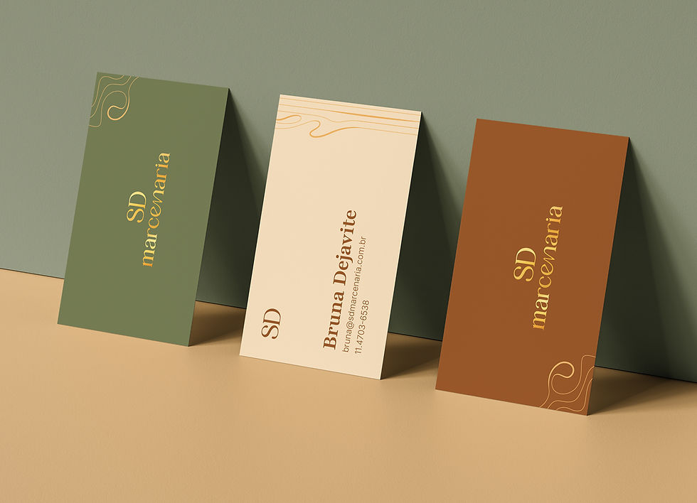
Stationery
-
Comercial presentation
Objective
With over 30 years of experience in the market, the company went through a rebranding process to align with new design trends and strengthen its position against competitors.
The new identity was developed to highlight the premium standard of its products, emphasizing quality and sophistication while bringing a more modern visual language.
A natural color palette was chosen to convey feelings of calm, comfort, and warmth, while also enhancing the photography of completed projects.
Business Impact
-
Creation of a new brand identity that strengthened the company’s market presence and reinforced its personality.
-
Development of a new commercial presentation layout, increasing credibility and confidence during the client prospecting process.
Services
-
Stationery
-
Comercial presentation
-
Brand Identity
-
Iconography
Services
-
Brand Identity
-
Illustration
-
Print materials
-
Merchandise design
-
Website design
-
Product photography
-
Social media design
Objective
The goal was to develop a brand focused on the product.
The concept behind the identity was inspired by customers experiences and feedbacks: the store was seen as fun, and customers love being able to personalize their bowls their own way.
Every design element was created to reinforce this fun and personalized identity, using photos that show different bowl combinations, and a typeface with a multiple ligatures and alternates, to allow flexible and dynamic content creation.
Impact
-
Store improvements were driven by ongoing customer research through social media and in-store feedback.
-
Characters originally created exclusively for merchandise became popular, generating purchase demand among customers.
-
Regular Instagram posts featuring weekly store promotions helped build customer loyalty.
-
Improved product photos increased purchase desire among customers on social media. Bowl photos receive high engagement and interaction.
Objective
With over 30 years of experience in the market, the company went through a rebranding process to align with new design trends and strengthen its position against competitors.
The new identity was developed to highlight the premium standard of its products, emphasizing quality and sophistication while bringing a more modern visual language.
A natural color palette was chosen to convey feelings of calm, comfort, and warmth, while also enhancing the photography of completed projects.
Business Impact
-
Creation of a new brand identity that strengthened the company’s market presence and reinforced its personality.
-
Development of a new commercial presentation layout, increasing credibility and confidence during the client prospecting process.
Visual elements
Natural colors were used to reference the brand’s main raw material: wood.
A serif typeface was applied to the logo and main headlines, conveying elegance and sophistication. In selected applications, curved custom lines connect two letters, designed exclusively for the identity, referencing the organic shapes found in wood texture.
A clean layout with strong emphasis on photography highlights the quality of the finished projects delivered to clients.

Icons
The contrast between thin and thick strokes, combined with the presence of curves, contributes to a more organic, fluid icon style with a distinctive and unique personality.


