Services
-
Brand identity
-
Illustrations
-
Brand strategy
-
Package
-
Stationery
Objective
The primary color palette is composed of soft pastel tones, carefully selected to convey feelings of calm, comfort, and lightness.
Custom illustrations were developed to reinforce the brand’s personality and authenticity.
The combination of sans-serif and handwritten typography adds a more personal and handcrafted character, aligned with the fact that all products are handmade by the founders.
Business Impact
-
Unique and meaningful gifts, with the possibility of fully personalizing each kit according to the customer’s preferences.
-
Direct contact with customers during the personalization process, creating a genuine connection between the brand and consumer.
Services
-
Package
-
Stationery
-
Brand identity
-
Illustrations
-
Brand strategy
Services
-
Brand Identity
-
Illustration
-
Print materials
-
Merchandise design
-
Website design
-
Product photography
-
Social media design
Objective
The goal was to develop a brand focused on the product.
The concept behind the identity was inspired by customers experiences and feedbacks: the store was seen as fun, and customers love being able to personalize their bowls their own way.
Every design element was created to reinforce this fun and personalized identity, using photos that show different bowl combinations, and a typeface with a multiple ligatures and alternates, to allow flexible and dynamic content creation.
Impact
-
Store improvements were driven by ongoing customer research through social media and in-store feedback.
-
Characters originally created exclusively for merchandise became popular, generating purchase demand among customers.
-
Regular Instagram posts featuring weekly store promotions helped build customer loyalty.
-
Improved product photos increased purchase desire among customers on social media. Bowl photos receive high engagement and interaction.
Objective
The primary color palette is composed of soft pastel tones, carefully selected to convey feelings of calm, comfort, and lightness.
Custom illustrations were developed to reinforce the brand’s personality and authenticity.
The combination of sans-serif and handwritten typography adds a more personal and handcrafted character, aligned with the fact that all products are handmade by the founders.
Business Impact
-
Unique and meaningful gifts, with the possibility of fully personalizing each kit according to the customer’s preferences.
-
Direct contact with customers during the personalization process, creating a genuine connection between the brand and consumer.

Logo concept
Since each person has a unique style and personality, the logo concept was built around the idea of individuality.
Five distinct personas were defined, each representing a different style. For each one, the letter “P” expresses the personality of that profile. The "P" is applied in the form of a postage stamp, creating visual unity across all brand variations.

Bold
An organic, expressive, and unique “P” shape associated with bold and confident profiles.

Romantic
A serif typeface with organic curves, creating a delicate and romantic style inspired by the naturalism of the Art Nouveau period.

Vintage
A retro typography style inspired by the classic decorative initials used in old books.

Modern
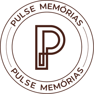
A construction based on the straight lines of modern architecture, where a single continuous line forms the “P,” with no defined beginning or end.

Classic
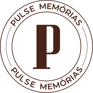
A high-contrast serif typeface, conveying elegance and a timeless, classic aesthetic.

Bold
An organic, expressive, and unique “P” shape associated with bold and confident profiles.

Modern
A construction based on the straight lines of modern architecture, where a single continuous line forms the “P,” with no defined beginning or end.

Vintage
A retro typography style inspired by the classic decorative initials used in old books.

Classic
A high-contrast serif typeface, conveying elegance and a timeless, classic aesthetic.

Romantic
A serif typeface with organic curves, creating a delicate and romantic style inspired by the naturalism of the Art Nouveau period.
Illustrations
Pastel-toned backgrounds combined with colorful illustrations featuring textures, high contrast, and vibrant colors create joyful, lively compositions with strong personality.


